- Prerequisites
- Introduction
- Adding a dashboard
- Dashboard overview
- Widgets
- Time window
- Settings
- Layouts
- States
- Import dashboard
- Export
Prerequisites
For faster learning and a better understanding of this guide, first, you have to follow the Getting Started guide to get familiar with IoT Hub devices and dashboards.
Introduction
IoT Hub provides the ability to create and manage dashboards.
Each dashboard can contain plenty of widgets. Dashboards display data from many entities: devices, assets, etc. Dashboards can be assigned to Customers.
This guide covers main concepts and various configuration settings.
Adding a dashboard
To add a new dashboard, you should:
- Go to Dashboard groups through the main menu on the left of the screen;
- To add a new dashboard group, click the “+” sign in the upper right corner of the screen, or open the “All” dashboard group and click the “+” sign in the upper right corner there;
- In the opened dialog, necessary to enter a dashboard title, description is optional. Click “Add”.
Make public
If you want to make your dashboard public and share a link to it, you should:
- Go to the Dashboard groups;
- Click the “Share” icon next to the dashboard group that you want to make public;
- In the confirmation dialog box, click “Yes”;
- Open the dashboard group and click the link icon opposite the needed dashboard;
- In the “Public dashboard link” dialog, click a copy button next to the link.
Now you can share a dashboard with this link. Note that you shouldn’t forget to make related devices, assets and entity views public in order to access their data.
Dashboard overview
Before starting working with a dashboard, get familiar with its interface to understand which features are responsible for what actions.
Title
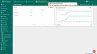
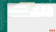
Editable dashboard title appears in the top-left corner of the dashboard. Dashboard title is displayed in the application breadcrumbs to simplify the navigation You can change and adjust a Title in the settings of the dashboard
Edit mode
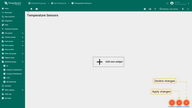
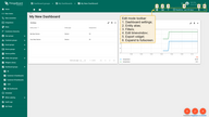
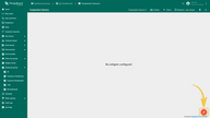
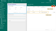
Use the “pencil” button in the bottom-right corner of the screen to enter dashboard edit mode. Once you switch to the edit mode, you can add new widgets and access controls in the dashboard toolbar. You can also use button “Apply changes” to save the dashboard or “Decline changes” to rollback all unsaved changes.
Toolbar
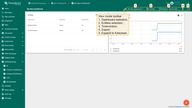
Dashboard toolbar allows you to manage states, layouts, settings, aliases, filters, and configure timewindow using the corresponding icons in the toolbar.
Some of these icons (stats, layout, settings) are visible only in the “edit” mode. All other icons are visible in both “view” and “edit” mode. You can hide these icons or configure the toolbar to be minimized by default using settings.
Entity Aliases
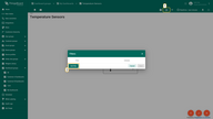
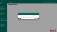
Entity Aliases determine which entities (devices, assets, etc) you would like to display on the dashboard. You can treat alias as a reference to one or more devices. These references can be static or dynamic.
An example of the static alias is the Single entity alias. An entity is configured once in the alias dialog box. All users see the same data if they have permission to access this device.
An example of a dynamic alias is the Device type alias, which displays all devices of a certain type (e.g. “Thermometer”). This alias is dynamic because the list of devices depends on the user using the dashboard. If you are logged in as a Tenant administrator, this alias will be resolved all Thermometer devices. However, if you are logged in as a Customer user, this alias will be resolved to Thermometer devices that are assigned/owned by that Customer.
Please see the Entity aliases documentation for more information.
Entity Filters
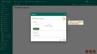
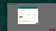
Entity filters allow you to specify a filter for the list of entities resolved by the entity alias.
let’s look at an example:
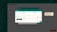
Suppose you have thousands of “Thermometer” devices, and you would like to display thermometers of a specific model and with certain battery levels.
Let’s also assume that thermometer model is stored as an attribute, and the battery level is stored as a time series data.
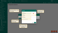
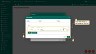
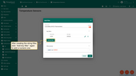
We will define a filter that checks if the model is “DHT22” and the battery level is less than 20 percent.
Please note: while adding the filter, you can configure the ability to edit it for users by moving the slider opposite the Filter name.
Filters are applied only to the “latest” value of the attribute or time series key. Don’t use this feature to “filter out” historical time series values.
You can combine different logical expressions over one key using “complex” filters. For example: “(A > 0 and A < 20) or (A > 50 and A < 100)”.
Also, you can combine two expressions for different keys using the “and” relation. For example: “(A > 0 and A < 20) and (B > 50 and B < 100)”.
It’s not possible to use “or” relation to combining different keys yet. For example: “(A > 0 and A < 20) or (B > 50 and B < 100)”.
See more examples how to use filters in this video:
Widgets
Widget types
All IoT dashboards are constructed using IoT Hub widgets that are displayed in Widget library.
Each widget provides end-user functions such as data visualization, remote device control, alarms management and displaying static custom html content.
There are five types of widgets:
- Time series widgets display data for a specific time window. The time window may be real-time (e.g., for the last 24 hours) or historical (December 2020);
Examples of time series widgets are chart widgets. Obviously, time series widgets are designed to display time series and not attributes; - Latest values widgets display the latest values of particular attribute or time series keys. For example, device model or latest temperature reading;
- Control widgets allow you to send RPC commands to your devices. For example, control desired temperature on the thermostat device;
- Alarm widgets allow you to display alarms;
- Static widgets are designed to display static data. For example, floor plan or static company information.
More about widget types you can learn here.
Adding widget to the dashboard
To add a widget to a dashboard, you should:
- By clicking the pencil icon in the bottom right corner of the screen, go to the Edit mode;
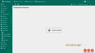
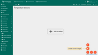
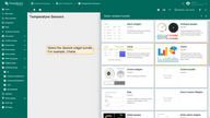
- Click a big sign in the middle of the screen or the “+” icon (“Add new widget”) in the bottom right corner of the screen. Click “Create new widget” to open the “widget selection” dialog box;
- Select widget bundle, for instance, “Charts”;
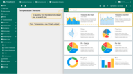
- To find the widget you want as quickly as possible, use the search bar by clicking a magnifying glass icon and inputting the name of the widget there. Select a widget, for example, “Timeseries Line Chart”, and click on it to open the “Add Widget” dialog box.
Widget dialog and settings
Widget consists of the widget type, one or multiple data sources, basic and advanced settings, and actions that you can add.
Therefore, the “Add widget” dialog contains four tabs for defining a widget. Note that only the data source configuration is strictly required.
You can leave all other configuration tabs with the default values in most of the cases.
1. Widget data settings
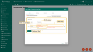
Widget data settings are for adding one or multiple data sources. A data source is a combination of a data source type, an entity alias, an optional filter, and list of data keys (entity time series). Basically, the data source determines which entities (alias and filter) widget should use and what data keys to fetch for those entities.
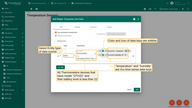
For example, let’s configure data source to fetch temperature and humidity values for all “Thermometer” devices that have model “DHT22”, and their battery level is less than 20 percent. We will use “Thermometer” alias and “Low battery DHT22 Thermometers” filter configured in the previous paragraphs of this doc (see alias and filter correspondingly).
In the above example, “temperature” and “humidity” are two time series data keys. The data keys list for data source depends on the widget type:
- Time series widgets allow choosing time series data keys in the data source and the time window;
- Latest values widgets allow choosing time series, attributes and entity fields;
- Static and Control widgets do not require a data source;
- Alarm widgets allow choosing all data keys: time series, attributes, entity and alarm fields. Additionally, you can configure time window and alarm filter.
Let’s assume you don’t have the required time series or attribute key in the database yet. In such a case, you can still add a key to the data source, and the widget will start displaying the data as soon as the device will send it to IoT Hub.
2. Widget data source types
- Entity data source
Entity data source fetches data from specified entity alias. Let’s get familiar with this feature using a basic example, displaying all existing devices on the widget.
Open a dashboard and start by adding an entity alias:
- Enter dashboard edit mode by clicking the pencil icon in the lower-right of the screen.
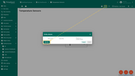
- CLick the “Entity alias” button on the toolbar, click “Add alias” in the lower-left corner of the Entity alias dialog box.
- In the opened Add alias dialog, enter an alias name, select Entity type filter type, and choose an entity type (in the given example, use Device entity type). Click “Add”.
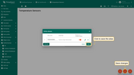
- Save the created alias by clicking the “Save” button in the lower right corner of the dialog.
After adding an alias, you need to add a widget to display data:
- Click the big sign in the middle of the screen “Add new widget”.
- Select Cards widget bundle. For viewing a list of entities, the Entity table widget is most suitable, so select it.
Now, it is time to add a data source:
- Select Entity type, choose the previously added entity alias. Click “Save” in the lower-left corner of the dialog window.
- After customizing a data source, click “Add” in the lower-left corner of the Add widget dialog box.
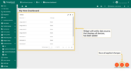
Widget that displays all devices through entity data source has been added.
- Entity count data source
Since version 3.2.2 IoT Hub has added an Entity count data source. This feature allows you to see the number of entities by displaying them on a widget and thus determine the number of devices, assets, etc.
Let’s get familiar with this feature using a basic example, displaying the total number of existing devices on the widget.
Open a dashboard and start by adding an entity alias:
- Enter dashboard edit mode by clicking the pencil icon in the lower-right of the screen.
- CLick the “Entity alias” button on the toolbar, click “Add alias” in the lower-left corner of the Entity alias dialog box.
- In the opened Add alias dialog, enter an alias name, select Entity type filter type, and choose an entity type (in the given example, use Device entity type). Click “Add”.
- Save the created alias by clicking the “Save” button in the lower right corner of the dialog.
After adding an alias, you need to add a widget to display data:
- Click the big sign in the middle of the screen “Add new widget”.
- Select Cards widget bundle and, to quickly find the desired widget use a search bar by clicking on the magnifying glass and typing the name of the widget you’re looking for. To see the number of entities properly better use the Simple card widget.
Now, it is time to add a data source:
- Select Entities count type, choose the previously added entity alias. To change a label, click the pencil icon: in the opened dialog, you can change a label name, edit its color, customize a special symbol that will be displayed next to the value, and specify the number of digits after floating-point. Click “Save” in the lower-left corner of the dialog window.
- After customizing a data source, click “Add” in the lower-left corner of the Add widget dialog box.
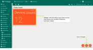
The widget that counts devices has been added. Nevertheless, by default, the special symbol of the widget itself (C°) is still there. So let’s enter the widget edit mode to remove it.
In the Settings tab, find the Special symbol line and delete the existing special symbol or replace it with the desired one. Also, you can indicate how many digits will be after floating-point. When changes are applied, don’t forget to save them by clicking the orange checkmark in the top-right of the dialog.
Now we have a widget that displays the number of existing devices.
- Function data source
Function data source is used when you do not have any date, but you’d like to test a widget visualization. Let’s say you haven’t added alias and haven’t received any telemetry, but you want to see how a widget displays data.
Firstly, to display data, you need to add a widget:
- Click the big sign in the middle of the screen “Add new widget”.
- Select Cards widget bundle. For viewing entities, the Entity table widget is most suitable, so select it.
Now, it is time to add a data source:
- Select Entity type, choose the previously added entity alias. Click “Save” in the lower-left corner of the dialog window.
- After customizing a data source, click “Add” in the lower-left corner of the Add widget dialog box.
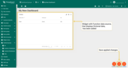
By dint of the widget with the function data source, we know how specific widget displays data.
3. Data keys
Data key defines time series, attribute or entity field that you would like to use in the widget. Data key definition consists of type (time series, attribute of entity field) and the actual key.
List of available attribute keys is basically a list of all client, server and shared attributes of your device or other entity.
List of available time series keys depends on what time series data you devices report to IoT Hub or what time series data you have saved via rule engine or REST API.
List of entity fields depends on the entity type and may extend in the future:
- Devices, assets and entity views have the following fields: create time, entity type, name, type, label, additional info.
- User has the following fields: created time, first name, last name, email and additional info.
- Customer has the following fields: create time, entity type, email, title, country, state, city, address, zip code, phone, additional info.
3.1. Basic data key settings
Coming soon…
3.2. Advanced data key settings
Advanced data keys configuration is responsible for the visibility, style, and appearance of a specific data key column on the widget. Entity table widget, alarms table widget, and entity admin widget bundles have the same advanced data key configuration. Charts widget bundle has its own unique advanced data key configuration. All other widget bundles have only basic data key configuration.
Learn more about advanced data key settings here.
4. Widget time window
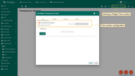
A widget time window defines a time interval and aggregation function that should be used to fetch the time series or alarm data. By default, every widget uses the main time window determined in the dashboard’s toolbar. You can overwrite the default time window using the “Use dashboard timewindow” checkbox. You can also hide the time window selection for a specific widget from the user using the “Display timewindow” checkbox.
Learn more about time window configuration here.
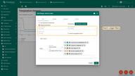
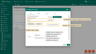
5. Alarm filter
In addition to the time window configuration, alarm widgets allow you to filter alarms based on status, severity, and type. You can choose a combination of alarm statuses and severity. You may also define specific alarm types as well as enable search of propagated alarms.
Basic widget settings
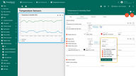
Let’s assume you have added the “Timeseries - Flot” widget to display thermometers using the widget data configuration step only. You should see a similar widget (note that you should send/simulate some data to see the actual lines in the chart):
Let’s use the basic widget settings to customize the widget. We will demonstrate how each setting affects the widget.
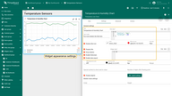
1. Widget Title
You can input custom widget title, tooltip and title style. You may also add an icon to the title and control icon color and size. See configuration and the corresponding result below.
Title style from the screen above:
1
2
3
4
{
  "fontSize": "10px",
  "fontWeight": 600
}
You may also completely hide the title using the “Display title” checkbox. You may also disable the widget shadow using the “Drop shadow” checkbox and disable fullscreen using the “Enable fullscreen” checkbox. All those settings are enabled by default.
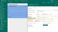
2. Widget Style
You can customize personal style for the widget using CSS properties. This style will be applied to the main div element of the widget. You can also change the background color, text color, padding, and margin. See the configuration and the corresponding result below.
Please note that the style and background color are just an example and are definitely not part of our guidelines.
Widget style from the screen above:
1
2
3
4
{
  "border": "3px solid #2E86C1",
  "cursor": "pointer"
}
3. Legend settings
For chart widgets, the “Display legend” option is enabled by default. The legend is used to display the min/max/average/total values. Other widgets have this option disabled.
While the legend is enabled, you can choose the direction and position of the legend. Also, you can choose which data to include (min, max, average, total) and either to sort the data keys or not.
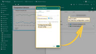
You may notice that the legend displays the data key label for each configured data key. When you have data from multiple devices in the same widget, it is hard to find which device corresponds to which record in the legend or in the tooltip. In order to make the legend and tooltip clear, you should use “${entityName}” or “${entityLabel}” in the data key configuration.
See configuration and the corresponding result below:
4. Mobile mode settings
Mobile Mode settings consist of two options:
- Order - set to an integer, specifies the priority of the order of displaying widgets in mobile mode (note that in mobile mode all widgets are displayed in one vertical column). If you need to arrange widgets in this column in a custom order, you can configure different order values for each widget.
- Height - takes an integer value from 1 to 10. It sets the height of the widget in Mobile Mode in the range from 70px (1) to 700px (10), ignoring its original height. For example, with a value of 5, the widget height will be 350px. (70 * 5) If no value is specified, its original height will be used.
5. Other settings
You can choose which symbol to display next to the value and the number of digits after the floating-point number. These settings are useful if you want to apply the same settings for all axis. For example, if you are showing temperature readings for multiple devices, you can add ‘°C’ or ‘°F’ symbol. However, if you are displaying both temperature and humidity, you have to configure these data keys separately using data key settings.
6. Advanced widget settings
Advanced widget settings are specific to widget implementation. Those settings allow you to fine tune the widget. For example, “Timeseries - Flot” widget allows you to configure line style, width, enable comparison with the previous time interval and use entity attributes in the legend.
Learn more about specific advanced settings in the corresponding widget documentation:
Coming soon…
7. Widget actions
Actions allow quickly and easily configuring the transition to the created state, transferring to other dashboards, or even updating the dashboard you are in. Depending on the widget, the action sources differ. However, the type of action you are able to choose will be the same for all widgets. Actions are adjusted in the Edit mode of the needed widget. To fully understand how to use Actions, you have to add a State to your widget.
Read more about widget actions in the documentaion dedicated to it.
Time window
Dashboard time window represents the time interval and aggregation function that will be used to fetch the time series or alarm data.
Time window is used by all the time series and alarm widgets unless they are explicitly configured to overwrite its execution.
In the case of a time series widget, IoT Hub fetches telemetry with a timestamp that matches the time window.
In the case of an alarm widget, IoT Hub fetches alarms with the created time that matches the time window.
The time window can work in two modes:
- In the real-time mode, widgets constantly receive updates from the server and automatically show you only the data that matches the time window for a current timestamp.
- In the history mode, widgets receive data only during the initial load and no updates are issued over WebSockets.
The data aggregation function is applicable for time series data and is not applicable for alarms.
There are five aggregation functions available at the moment: Min, Max, Average, Sum and Count. The special function called None is used to disable the aggregation.
Data aggregation is useful when you don’t want to fetch all time-series data to UI, and you would like to pre-aggregate it on the database level.
Using the aggregation functions saves network bandwidth and computation power of the client browser.
We recommend using aggregation functions whenever is possible if you have a lot of raw values.
Since version 3.2.2, it is possible to use predefined intervals (Current Day, Previous Day, Previous Month, etc.) in addition to last X minutes/hours/days. Note that the Current day interval means 24 hours (12 am at night to 12 am the next night), whereas the Current day so far means from 12 am at night until the time when the time window was updated. All other intervals are distinguished in the same way.
There are times when the time intervals are long, and you’d like to see the data closer without changing timestamps, therefore, you need to zoom in. Zoom in by holding the right mouse key and move it on the chart in the place where you need to get a closer look. To zoom out to the original size of the chart, double-click on the widget.
Version 3.2.2 introduces time zone configurations. By default, dashboard uses the time zone provided by the browser. Now it is possible to set the time of your browser or a specific country. To quickly find the needed time zone, start typing its name in the time zone bar.
Settings
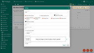
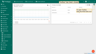
Dashboard settings allow adjusting and altering the overall look of the Dashboard. To start customizing the Dashboard for a better user experience, the first thing you need to do is to enter the Edit mode by clicking the “Pencil” icon at the bottom right of the page (Enter edit mode).
After entering the edit mode, click the “Gear” icon at the top of the window, so the Dashboard Settings will be opened.
State controller
The first thing that can be changed is State controller. By default, it’s set to “entity”, so to use all the features and work with the Dashboard as comfortable as possible we need to leave it that way.
Leave toolbar opened
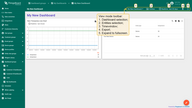
The checkbox Leave toolbar opened is responsible for displaying the toolbar on the Dashboard page. Toolbar allows changing the dashboard you’re currently using, edit timewindow, export dashboard and expand the dashboard to the full screen.
If we remove the checkmark, the toolbar will be closed. Instead of it, on the upper right of the screen you find the three-dots icon. By clicking on it, the hidden toolbar will be opened.
Title of the Dashboard
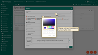
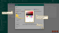
If you’d like to see the Title of the Dashboard, you need to check the box Display dashboard title. The default text color is black. Color and transparency are easily adjusted using the Title color parameter by clicking the colored circle and choosing the desired color for the title by moving the slider. The changed title appears on the top left of the Dashboard.
Dashboard Toolbar Settings
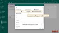
The checkboxes Display Dashboard selection, Display entities selection, Display filters, Display timewindow, and Display export are responsible for the visibility of the appropriate options on the Dashboard toolbar panel.
Filters option is shown on the toolbar panel only when the one has been created. If the filter was created, but you’d like to limit the customer’s opportunity to modify the device’s indicators, we disable the ability to see filters on the toolbar panel by unchecking the corresponding checkbox.
Color
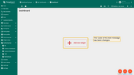
The line Color indicates the color of the text messages that you may see while editing your Dashboard. The Color adjusts by clicking the colored circle on the left from the line. A small window will open, and by moving the sliders, you can adjust the color and transparency of the text. By default, the color is set to black. For instance, if the widgets haven’t yet been added to the dashboard, and we change the Color, the message “Add new widget” will change.
Capacity
- Columns count
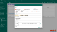
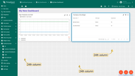
While editing the Dashboard, specifically the size and space of your widgets, you can notice a whitish grid on a grey background. These are columns that determine how many widgets can fit horizontally on a Dashboard. By default, the number of columns is 24. You can increase or decrease their number. The minimum number of columns is 10. The maximum number is 1000 columns.
- Margin between widgets
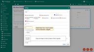
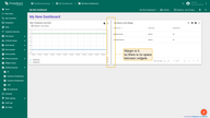
This margin type determines how much space is between widgets. Be default, the margin is set on 10. You can remove it by placing 0 in the Margin between widgets line, or increase margin, that is, the distance between widgets. The maximum margin is 50.
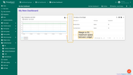
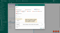
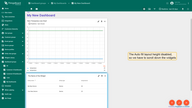
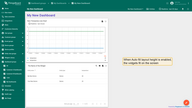
- Auto fill layout height
By default, the Automatic Fill Layout Height checkbox is unchecked so that you can freely adjust the size of the widgets. If you tick this option, all the widgets on the Dashboard will fill in vertically in the space of the screen.
Background settings
Background color
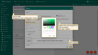
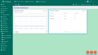
The Background color option allows you to customize the color that you’d like to be on the Dashboard’s background. To alter it, click on the colored circle, and with sliders choose the needed color and wished transparency. Then, press “Save” to apply changes. After saving, you can see the customized background.
Background image
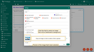
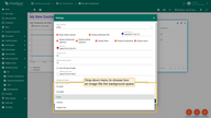
This option allows setting the picture as a background. To do this, you should drop an image in the appropriate field, or upload it from a folder on your computer. Once you select it, an image preview will appear on the left of the Settings window. To adjust the position of the image more precisely, click the drop-down menu and choose how exactly the picture will fill the background space. For instance, let’s choose “Cover” and click “Save” to see how the background has changed.
Mobile layout settings
By default, the Automatic Fill Layout Height checkbox is unchecked so that you can freely adjust the size of the widgets on your mobile device. If you tick this option, all the widgets on the Dashboard will fill in vertically in the space of the screen.
Mobile row height determines how tall you’d like your widgets to be on your mobile device. By default, the height is set to 70px, but you can make it smaller or larger. The minimum Mobile row height is 5px, the maximum is 200px.
Layouts
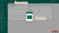
Layouts define how widgets are arranged on a Dashboard. To manage a layout, you should enter the Edit mode by clicking the “Pencil” icon at the lower right corner of the screen. As soon as you appear in the Edit mode, click the small button three-rectangles “Manage layouts” in the upper left corner of the Dashboard window. It opens the small window for layouts’ control.
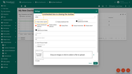
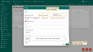
The Main layout is the one which you’re managing now. Basically, it’s your dashboard. If you click the big blue square button named “Main”, the Layout settings window will open. The layouts’ settings are identical to the Capacity and the Background of the Dashboard settings.
If we tick the “Right” checkbox, we divide the Dashboard into two separate parts. For each part, we are able to configure their own settings and interface.
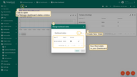
Just to see how it can look like, let’s set up both layouts in completely different ways. On the screenshot, you can see how the settings differ from each other (it is just an example and definitely not a recommendation). After adjusting the settings, click the “Save” button in the Layouts window to see the changes.
States
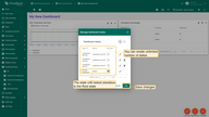
The States feature exists to create a layered hierarchy in your Dashboard. To use States properly you need to assign a specific action to a widget that will help you fast “travel” among the required states. To do this, you should click the upper left button with two-layered squares “Manage dashboard states”. It will open the window with a dashboard state configuration.
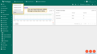
Since you haven’t created any states yet, you have only your “Root state”, namely your Dashboard. Root state defines the main state of your hierarchy. After creating additional states. You easily can change a root state by clicking the “Pencil” icon (Edit dashboard state) and ticking the “Root state” checkbox.
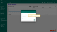
To add a new state, you need to click the “+” button in the right upper of the window, it will open a small window for a creating of a new state. Give it a name, a State ID will form automatically according to the name, but you can change it.
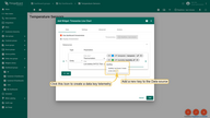
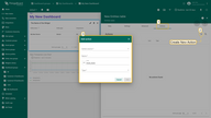
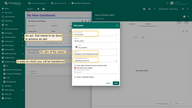
Giving a corresponding action to a particular widget allows traveling between states. To add an action, you should click the “pencil” icon (Edit widget) at the upper right corner of the widget to enter the widget configuration field. There you need to navigate to the “Action” cell and click the “+” icon to add a new action. It will open the “Add action” window.
- Action source is a particular act that needs to be done to achieve an aim.
- Name means a preferred title to an action.
- Icon defines a symbol for action.
- Type determines an aim of the action.
In our case, a Type should be “Navigate to new dashboard state”. After choosing this option, the line “Target dashboard state” will appear, where we have to choose a newly created state. When the configuration for a new state is done, click the “Save” button. The new state appears in the Action list. Click the orange tick mark at the upper right of the window to apply changes.
As we have chosen the “On row click” action, we need to click on the row of our widget to bring the action into effect. After clicking, we immediately transfer to the chosen state.
For the state to be named after the entity, use ${entityName} as the name of the state. Thus during the action, you will be transitioned to a state that is called the same as the entity that took part in the action.
Import dashboard
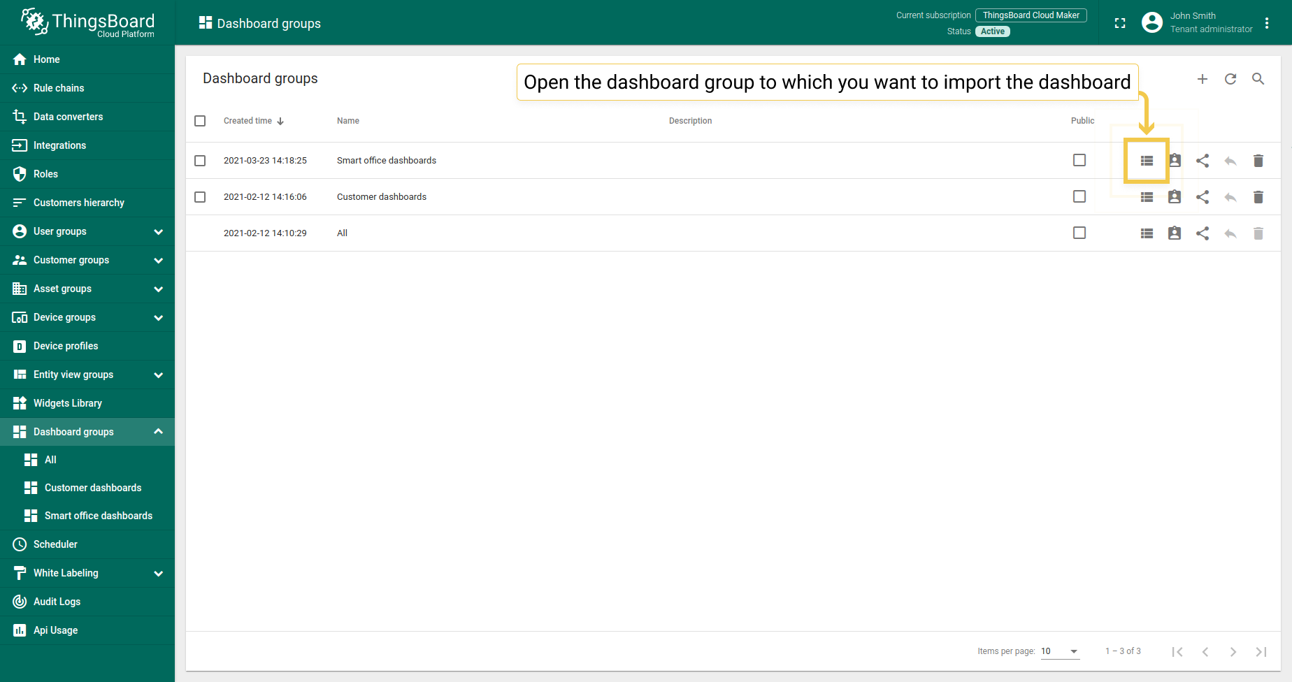
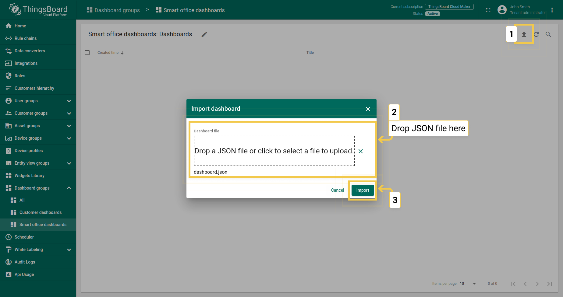
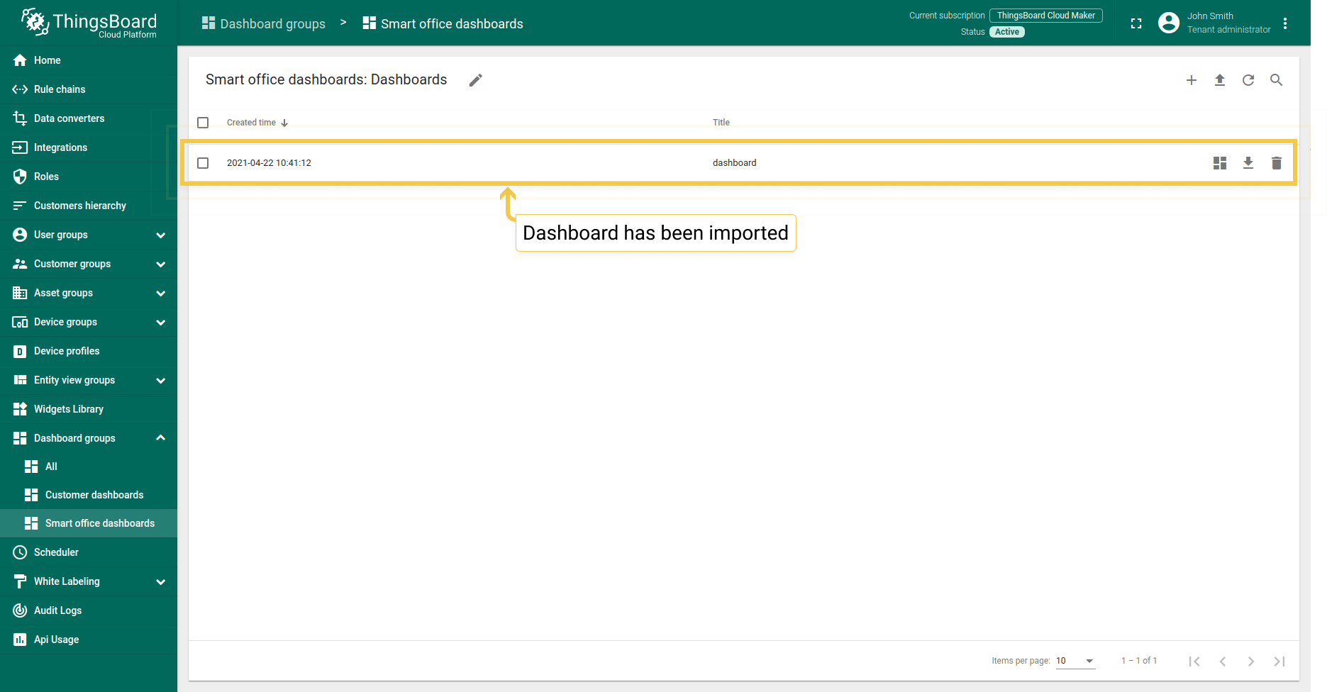
You are able to import a dashboard in JSON format. To import a dashboard, you should go to the Dashboard group and click on the “+” button in the upper right corner of the page and choose “Import dashboard”. The dashboard import window should pop up, and you will be prompted to upload the JSON file and click “Import”.
Export
In IoT Hub Community Edition, a Dashboard export or an exporting of a specific widget is possible as a configuration file in JSON format. You can use this file to transfer your Dashboard or widget configuration to another instance.
Export dashboard
In the Dashboards section, find the dashboard you want to export from the list. Opposite the name of the dashboard in the list, click on the “Export dashboard” button. The configuration file in JSON format with all settings on the control panel will be saved on your PC.
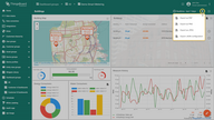
You can do this directly from the Dashboard. Open the Dashboard and click the “Export dashboard” button in the upper right corner of the screen.
Export widget
To export the widget, you should go to a Dashboard, where the widget is located.
Then go to the “Edit mode” by clicking on the “Pencil” icon in the lower right corner.
Now in the upper right corner of the needed widget, click the button “Export widget”.
This action saves the configuration file of the JSON format with all the settings of a particular widget to your PC.
IoT Hub export
In IoT Hub, dashboard export is possible in several additional formats: PDF, PNG & JPEG. This is useful when you need to send the data displayed in your dashboard by email or print.


